The Town of Miami Lakes brand standards include the Town of Miami Lakes logos, colors, photography, and digital presence that identify and represent our organization and its commitment to Growing Beautifully. These elements and guidelines will be used according to the standards provided or by permission from the Communications & Community Affairs Department.
Our brand standards are simple but core to the identity of Miami Lakes and its rich history and culture. This is to ensure that we are moving in the same direction to promote and represent Miami Lakes in accordance with its founding principles.
LOGOS
REQUIREMENTS
Before utilizing our logos, be sure to follow the following rules:
- Comply fully with our Brand Guidelines
- Do not alter the shape, proportion, color, or orientation of the logos
- Provide at least as much padding around the logos as what is displayed below
HORIZONTAL (PRIMARY)
The logo encapsulates our town’s history by use of a tree as its central motif—its base being a stylized ‘M’. Reinforcing this identity is the color scheme of blue, for the various lakes in our home, and green, for the healthy and proud greenspaces we have all around us.
VERTICAL
There are two acceptable versions of the Miami Lakes ‘Growing Beautifully’ logo. The horizontal version will be used in most cases and is the preferred version. If the use of the horizontal logo does not fit the use case in question, the vertical version will be used in its place.
SIZING
To ensure that all elements—text and graphics—are represented accurately, proper sizing is required for the Town of Miami Lakes logo. No alterations should be made to the logo to satisfy its inclusion in media.
The minimum size for printing the horizontal logo in 1.5″ wide, and the minimum size for printing the vertical logo is 0.75″ wide. If the logo must be smaller than the listed dimensions, approval must be sought by the Communications & Community Affairs Department.
SPACING (EXCLUSION ZONE)
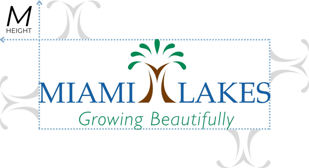
The logos should be provided space around text or other featured logos. The exclusion zone is equal to the height of the “M”. Always allow at least this amount of clear space around the logo. This is not a placement guide. It is a minimum only. This is to ensure that there is a clear distinction and recognition available to all parties!
COLORS
PRIMARY COLORS
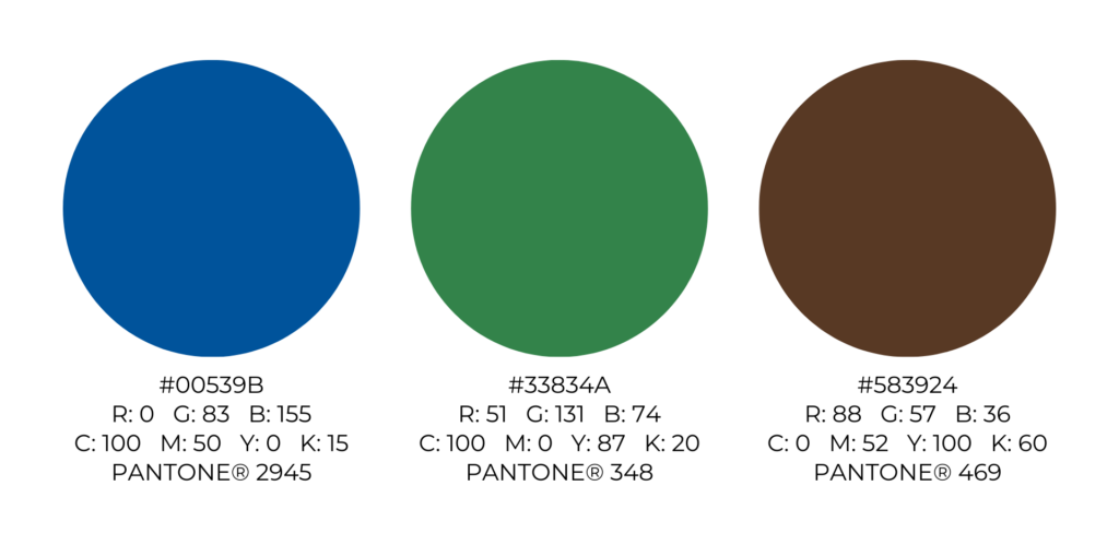
The following colors are approved for Town use and representation, and can be used alongside the official logo(s).
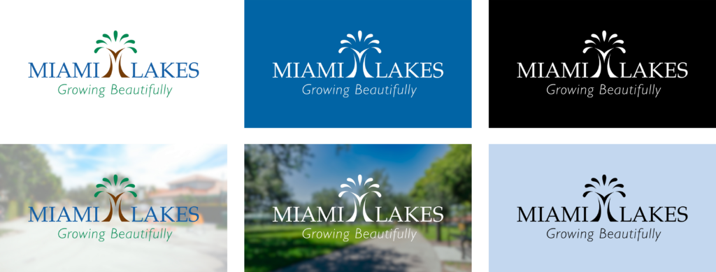
KNOCK OUT & BLACK / GREYSCALE
In certain cases, it will be necessary to knock-out the logo from a background color. Likewise, it may also be necessary to print the logo in only black or grayscale.
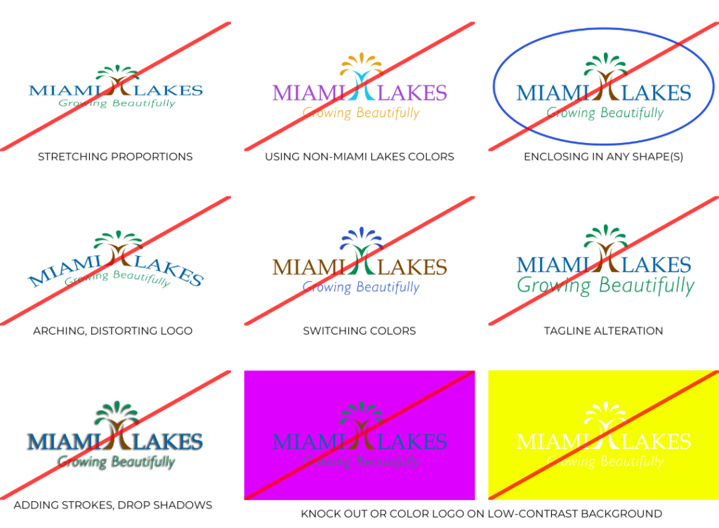
LOGO DON’TS
Adhering to the guidelines in this manual will provide a consistent brand unity. The following are just some examples of “what not to do” with the Miami Lakes logo.
